


Redesigns
The Martian
A redesign of Andy Weir's classic novel "The Martian", with a focus on typography.
This cover focuses less on imagery and more on subtle design decisions that better represent the story without giving anything away.
A central theme of this book is distance and the journey back home something I wanted to focus on for this cover. The upside down "i" represents the earth and the dot on the "i" of Weir the sun. And on the bottom the semi circle is mars.


Super Chill Ice
In an attempt to create a "luxury" version of "Super Chill Ice" (one of the worst names ever) I assessed what directions would be possible while keeping the name.
I had to reevaluate what I consider "luxury" since the more luxurious the design looked the more out of place the name felt.
So instead I embraced the absurdity of the name and decided to market it towards young males 6-24. Creating a brand that felt fun and almost ironic.
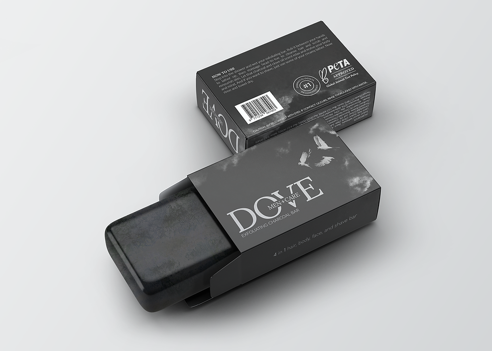
Dove Men+Care
When it comes to the soap selection for men the options are limited in diversity. There seems to be no minimalistic luxury style design like I often see on the women's side.
Dove Men+Care Exfoliating Charcoal Bar seems to blend in with every other option, and I would argue they are at a disadvantage due to the famine nature of the Dove brand. So I focused on creating a design that would be appealing to men while keeping it simple.

Beyerdynamic
Beyerdynamics has one of my least favorite logos. So I started with that.
Beyerdynamics current packaging makes it look more like a low budget alternative brand, not the high quality audio brand that has been a leader in studio headphones for the last decade. This design was created to communicate just that by using a minimal greyscale pallet, close up images that don't fully show the product, and gradients in the logo and icons, this packaging creates a sleek aesthetic focusing on innovation mirroring the uncomplicated straight forward quality the headphones are known for.